ClientTuta Cosmetics
LocationIraq
ServicesLogo Design
Visual Direction
Packaging Concepts
Social Media Concepts
Retail Visualization
StudioQ ART
Tuta Cosmetics
A beauty identity with a distinctive signature.
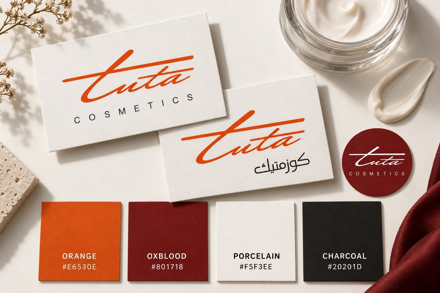
Tuta Cosmetics is a cosmetics brand based in Iraq. Its English and Arabic logo versions share a flowing signature, giving the brand a recognizable presence across languages.
The original logo design provides the foundation for a proposed visual direction: expressive orange, a deep red accent, light surfaces and tactile cosmetic imagery.
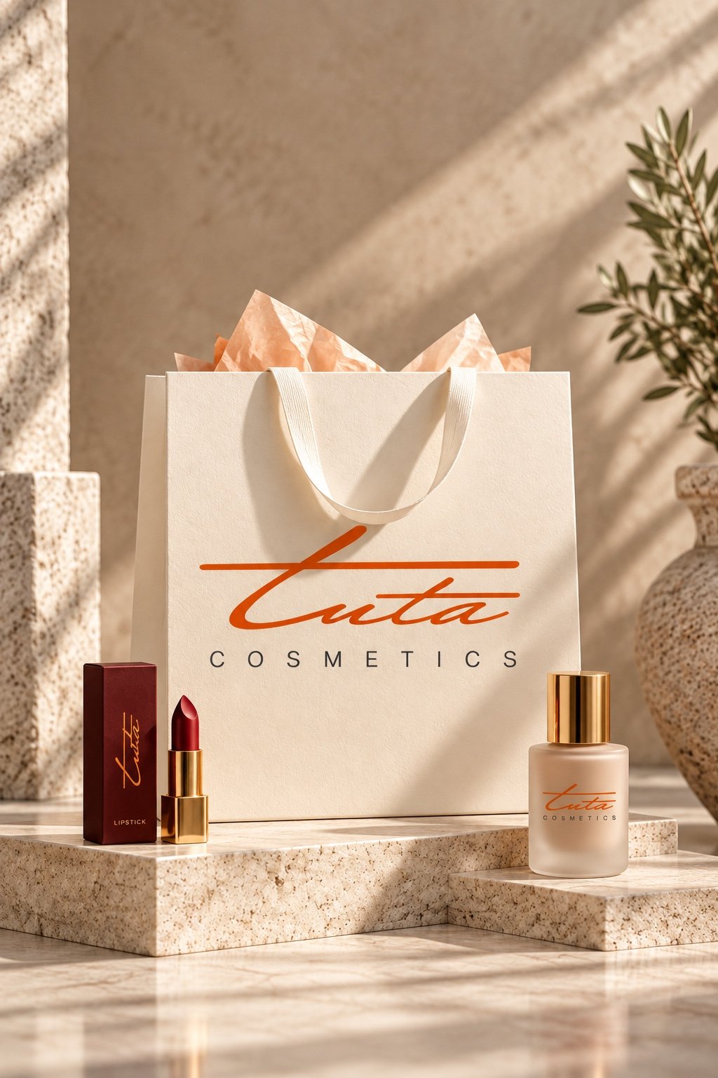
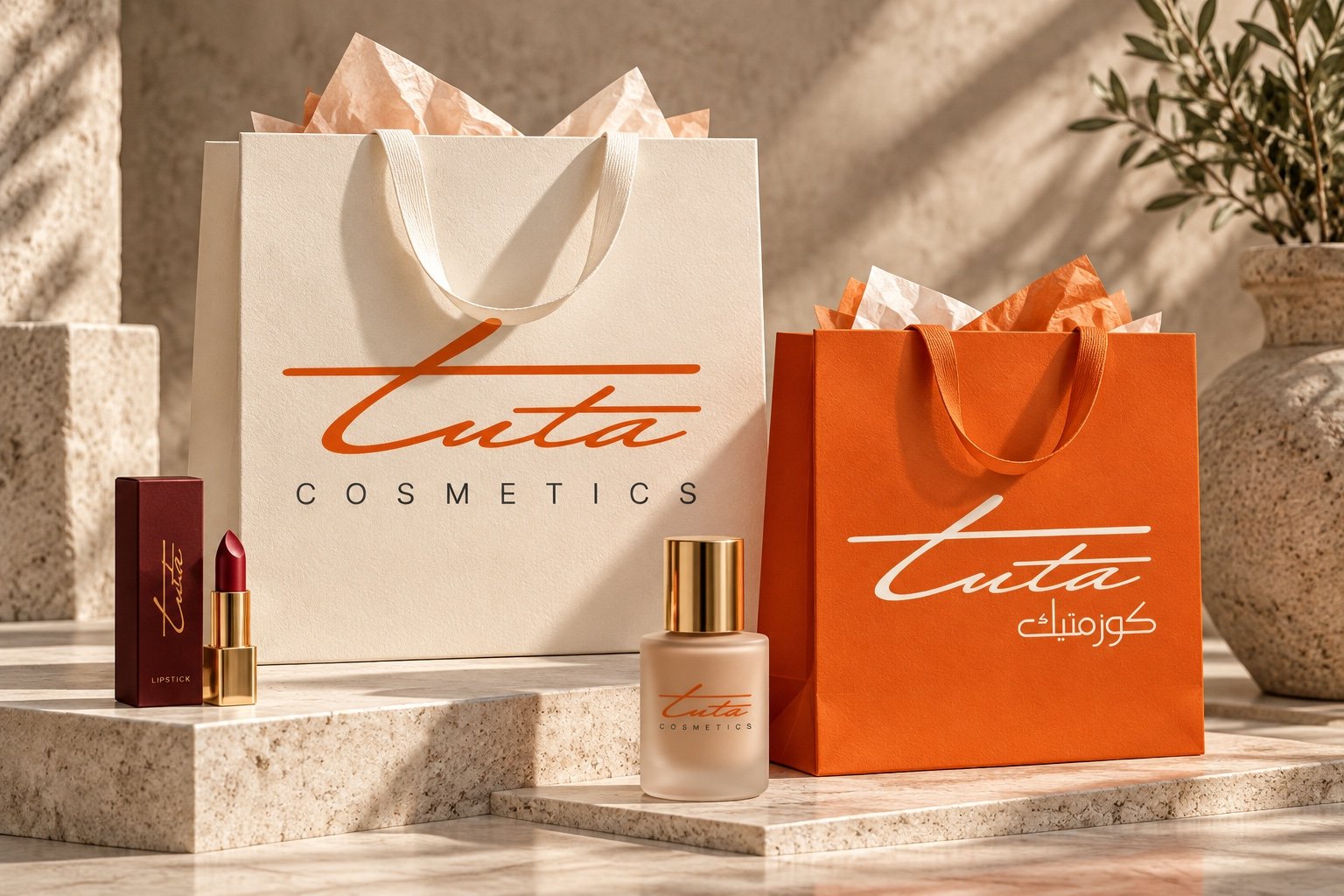
This presentation extends the supplied logos into eight concept visualizations, from shopping bags and product packaging to social content and a retail display. The applications and supporting palette are newly developed concepts, not a reproduction of the original brand guidelines.
A signature in two languages.
Orange #E6530E and oxblood #801718 come directly from the supplied logo files. Porcelain #F5F3EE and charcoal #20201D are proposed supporting colours. Orange leads on packaging; deep red gives seals and smaller details a consistent accent.
From skincare to colour.
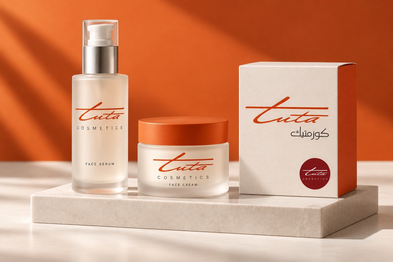
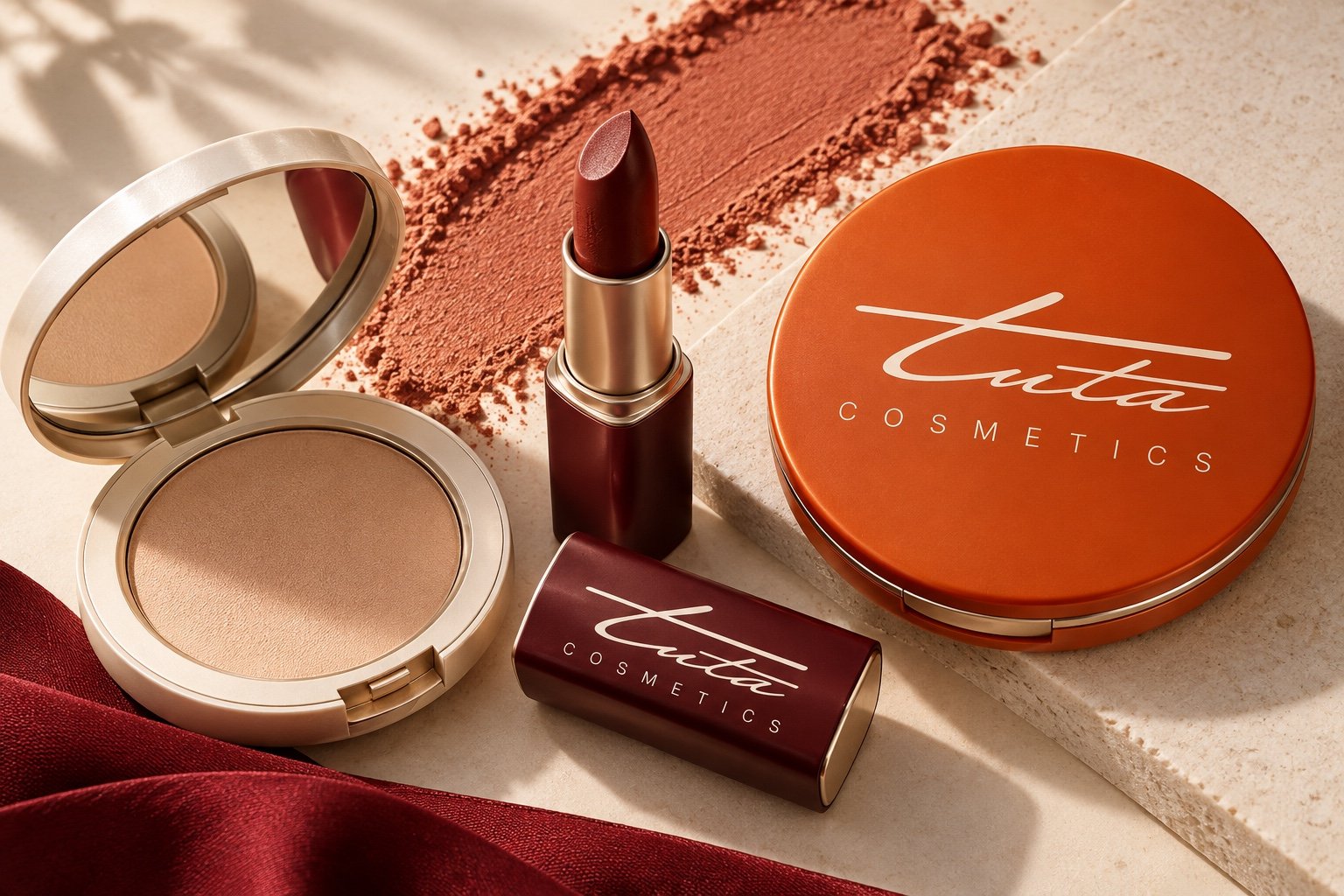
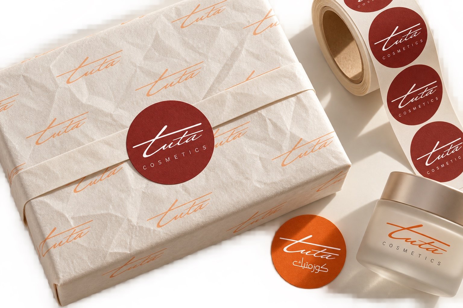
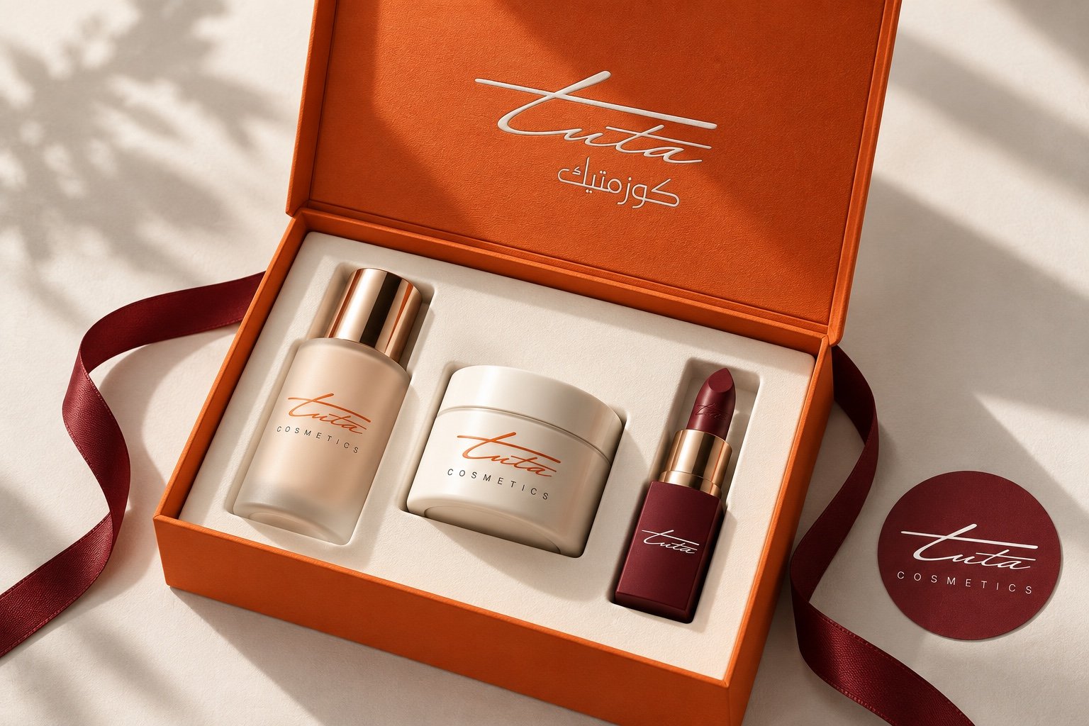
Frosted glass, clean labels and clear space around the signature carry the identity across skincare and make-up. The Arabic and English lockups remain distinct applications of the same mark.
The details of unboxing.
A consistent social presence.
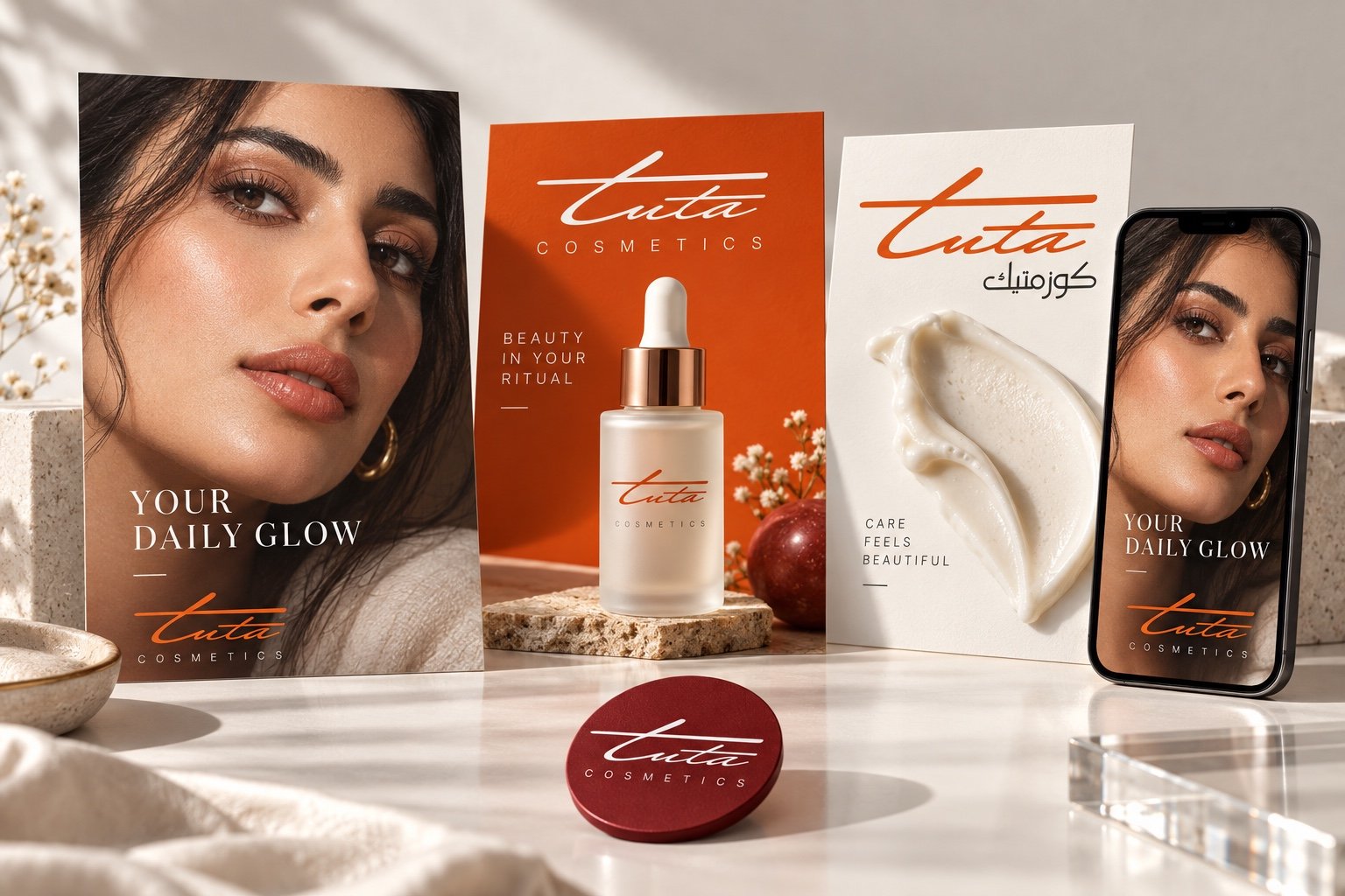
Close beauty portraits, visible skin texture and product details establish the proposed image direction. Warm light and restrained layouts connect campaign posts and vertical stories with the packaging.
From screen to storefront.
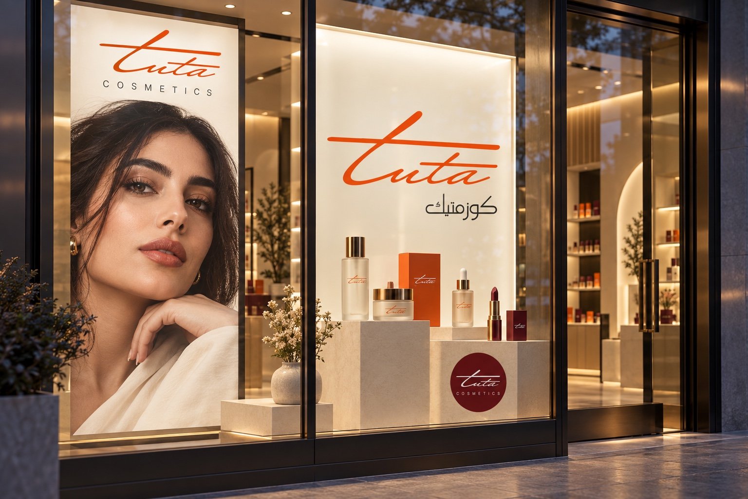
A cosmetics window display brings the bilingual identity into a physical setting. Large marks, softly lit products and a beauty campaign create a clear hierarchy from a distance.