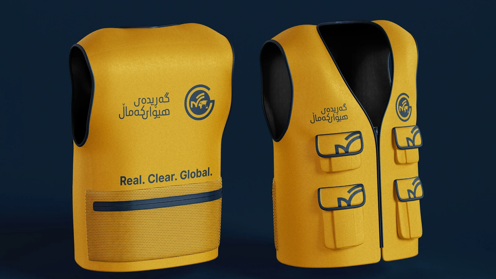
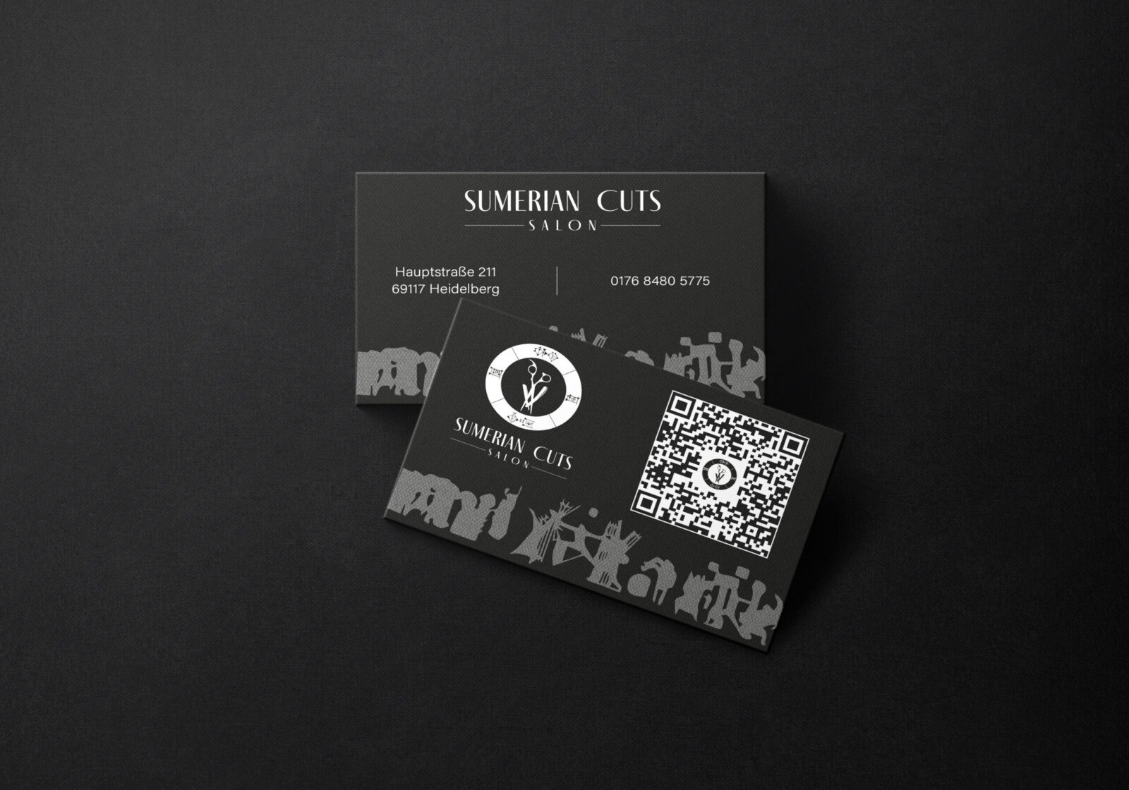
A bold identity for excavation and timber transport.
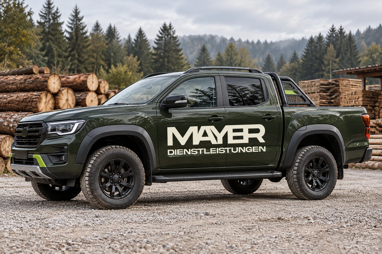
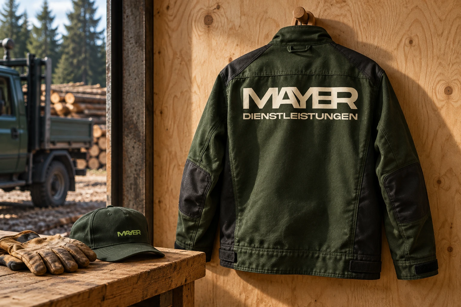
Mayer Dienstleistungen needed a visual language with the strength and clarity of the work itself. The angular wordmark creates a distinctive silhouette, designed to stay recognisable across vehicles, workwear and site signage.
Forest green and a fresh green accent connect the identity to its outdoor setting. Sand, off-white and charcoal bring warmth, contrast and balance. A clear typographic system keeps everyday communication direct and readable.
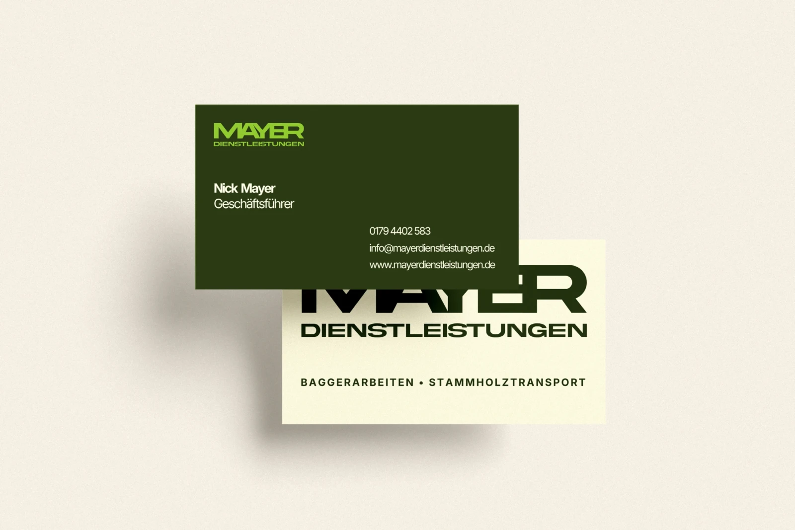
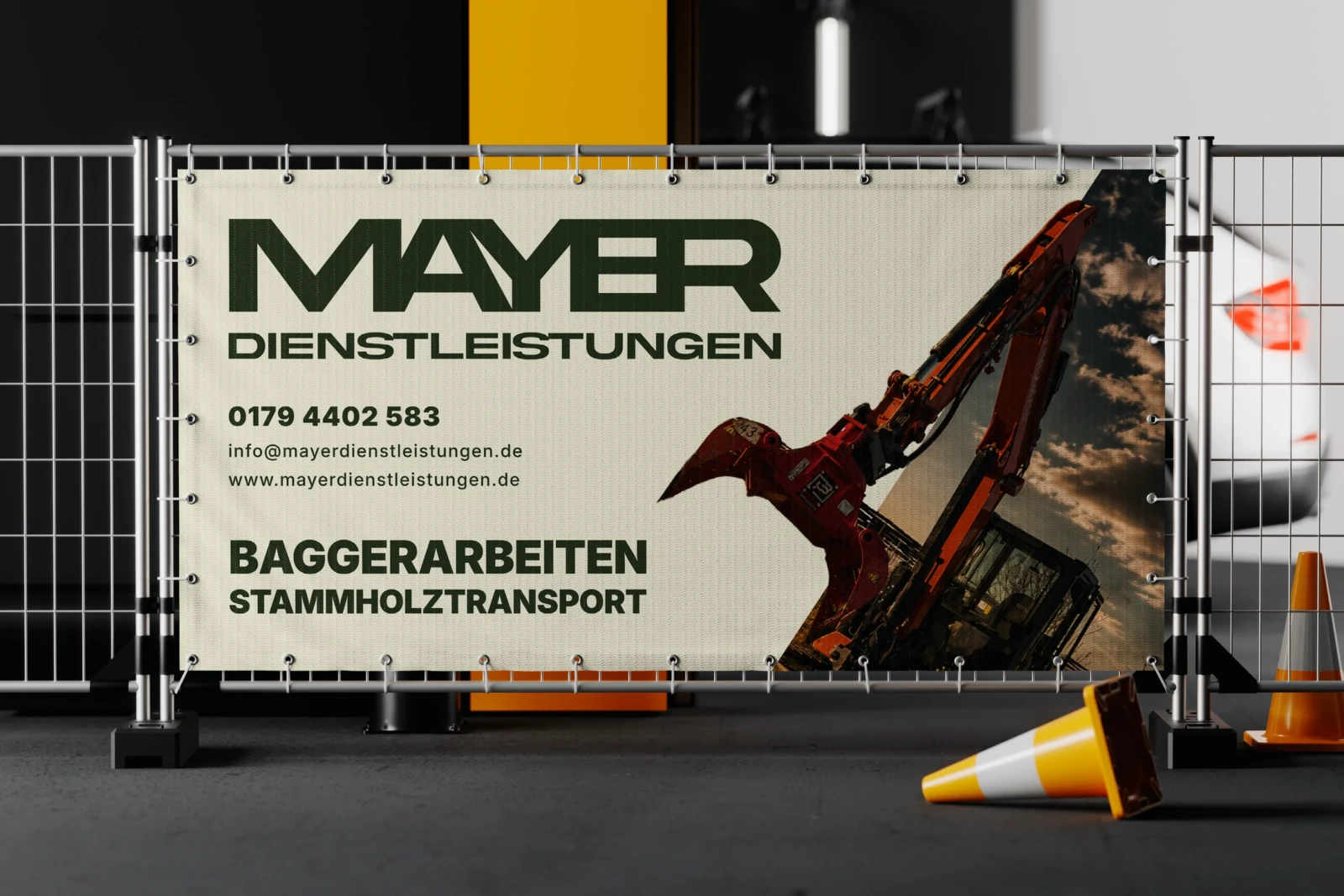
The brand guidelines bring the logo, colour palette and typography together with business cards and a construction-site banner. Vehicle and workwear mockups explore how the identity extends into the working environment.