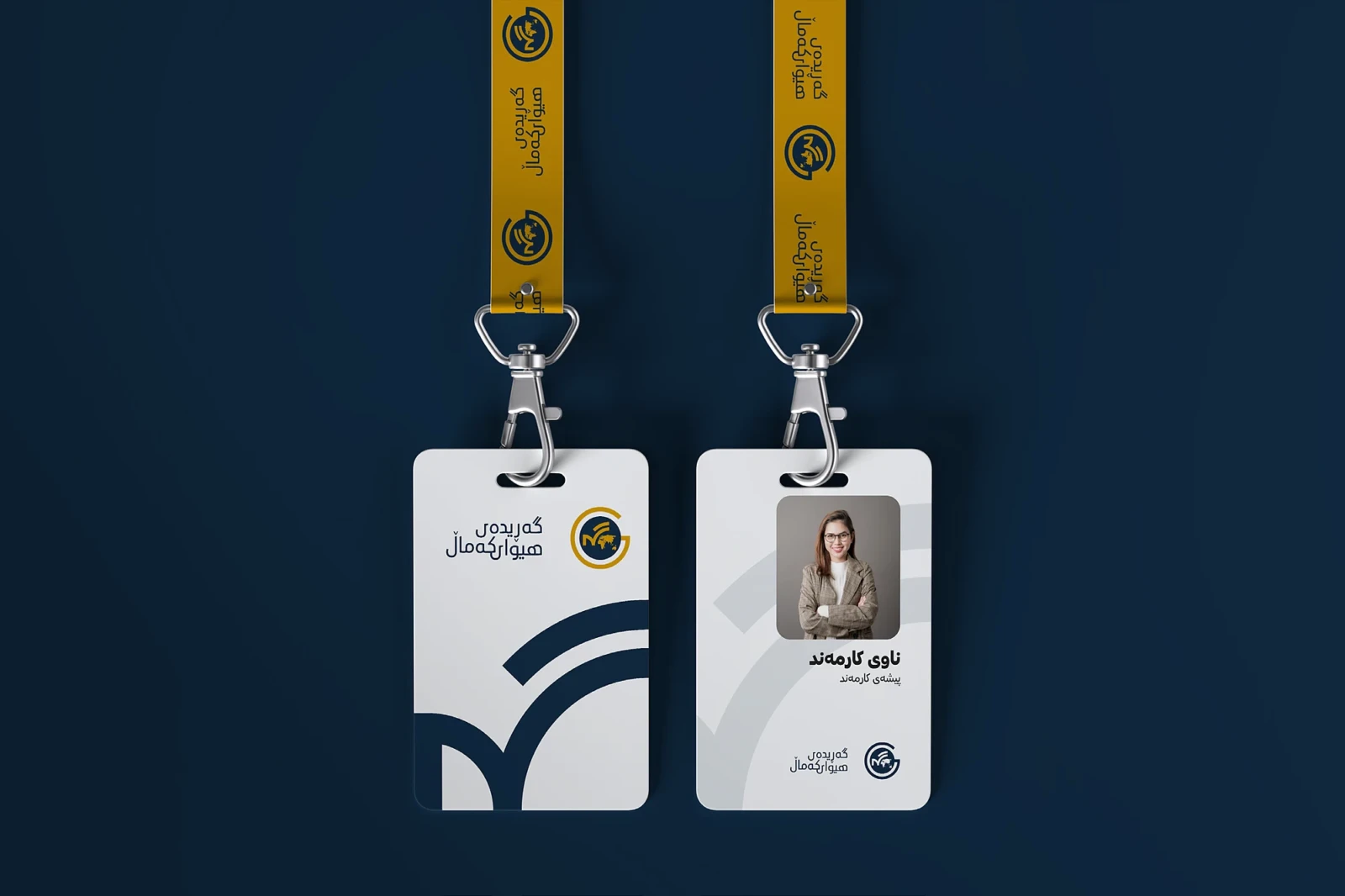
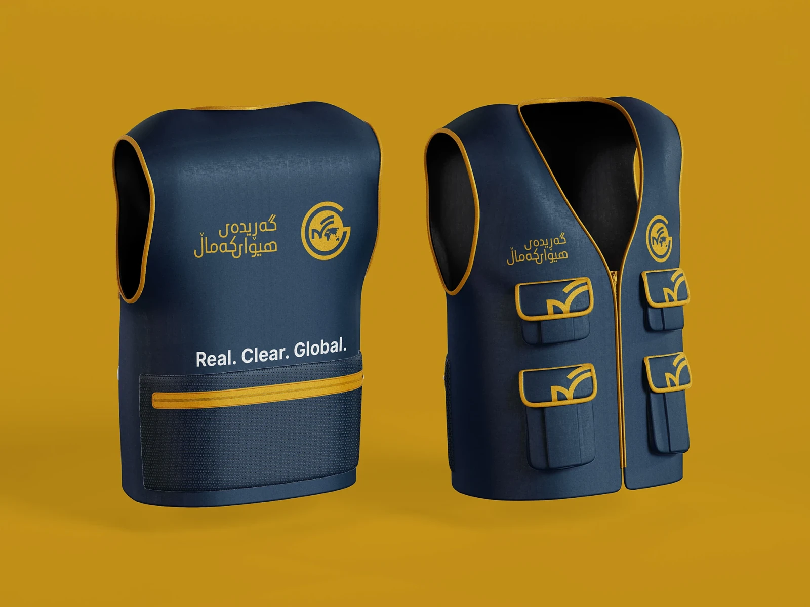
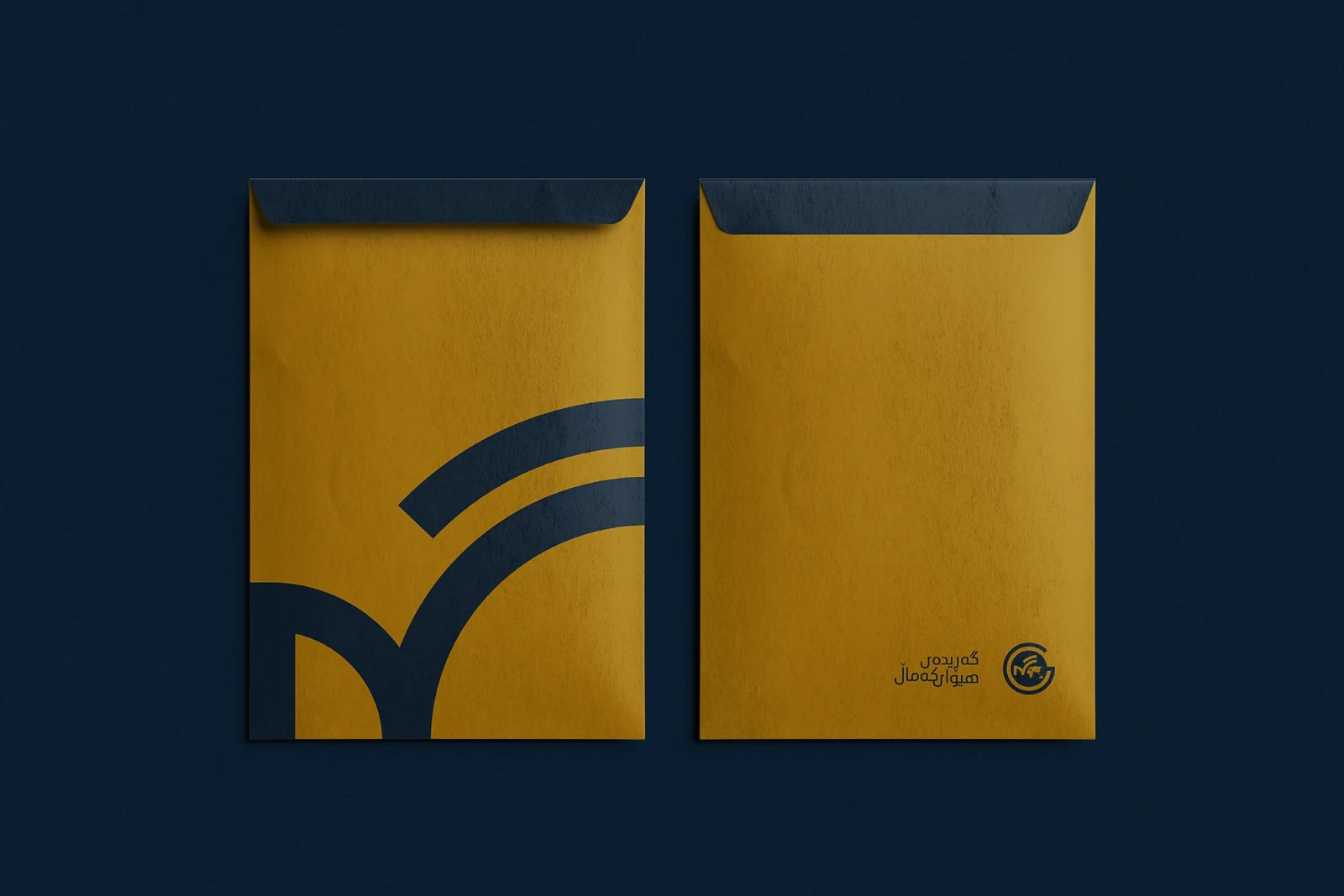
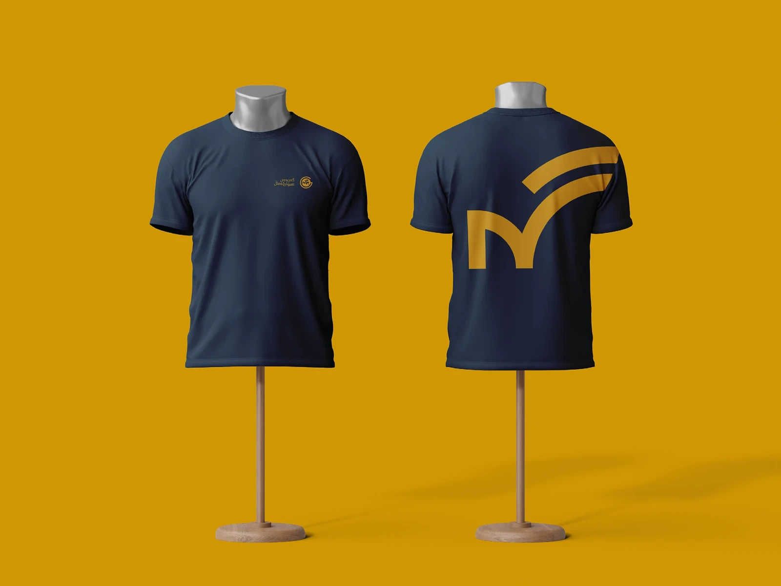
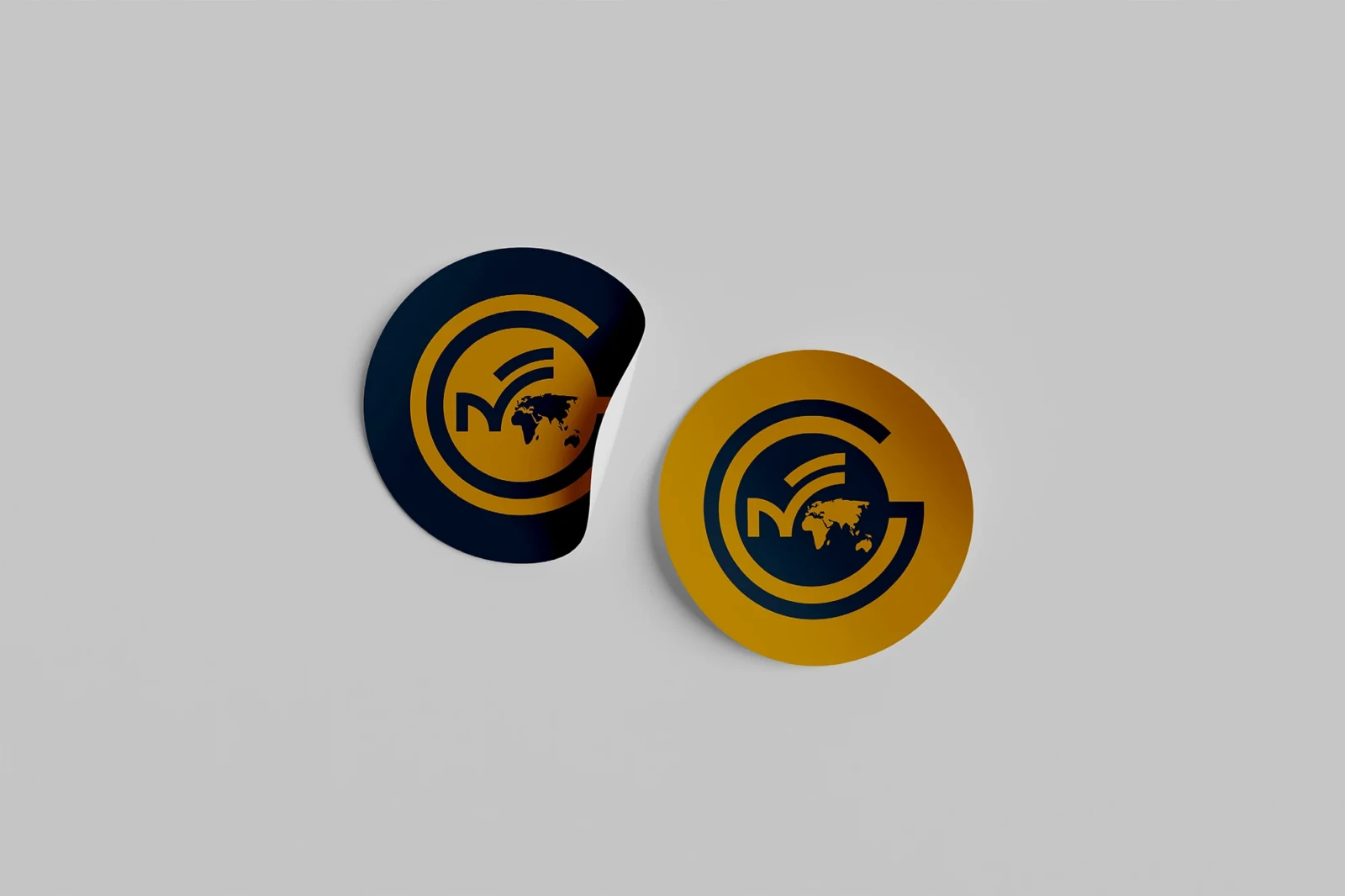
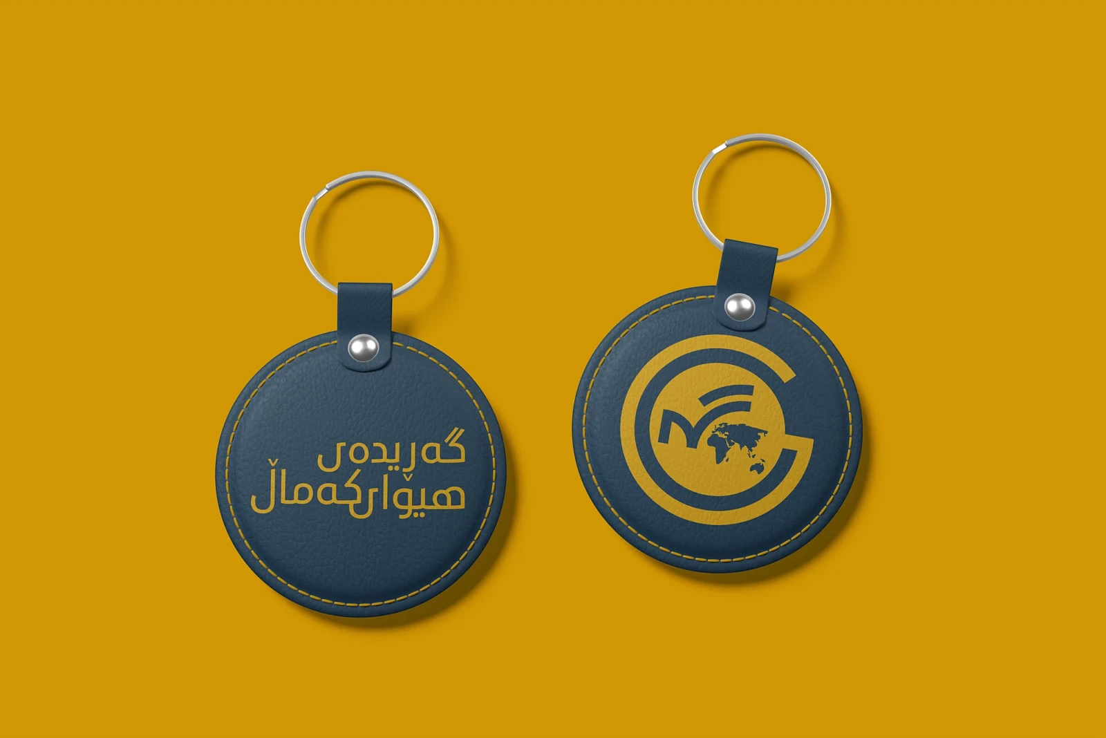
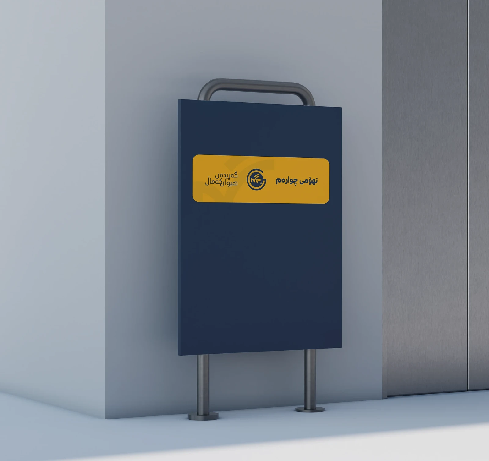
A full identity system for a Kurdish media organisation reporting to a global audience.
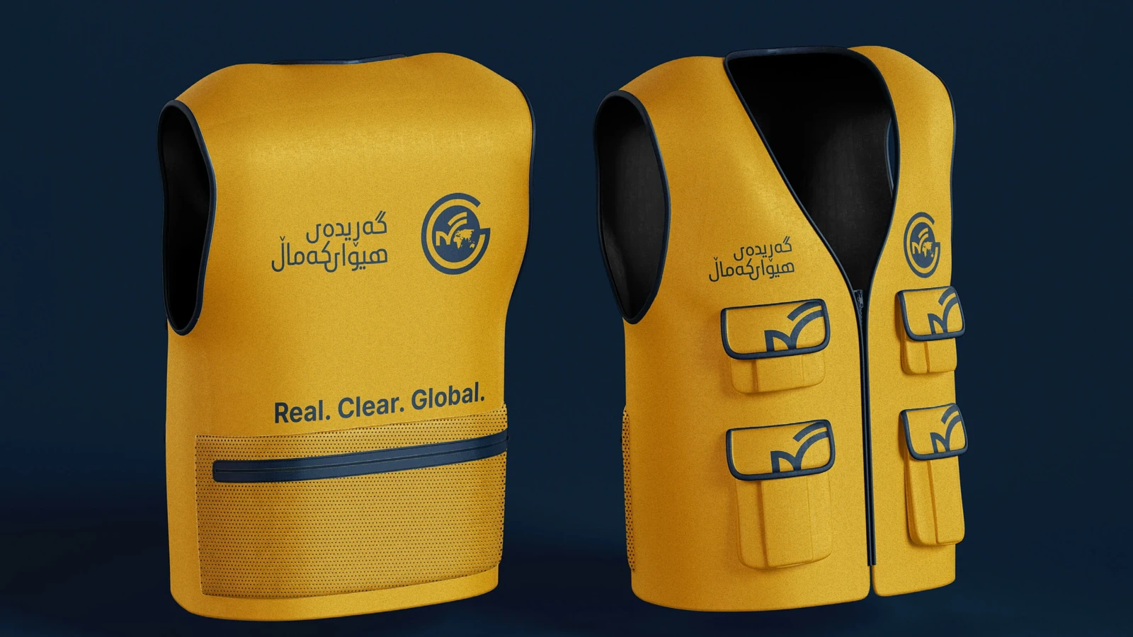
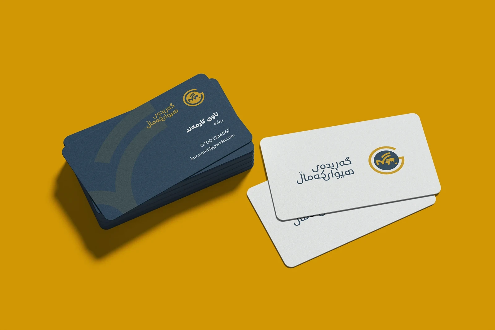
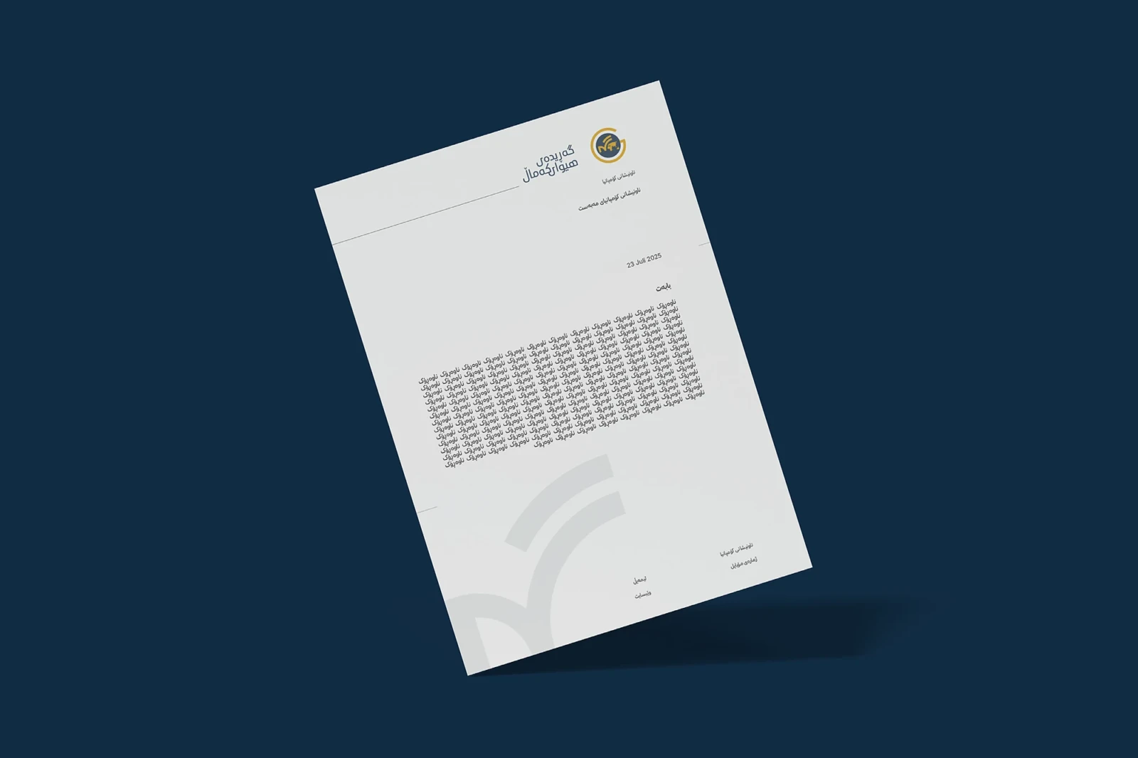
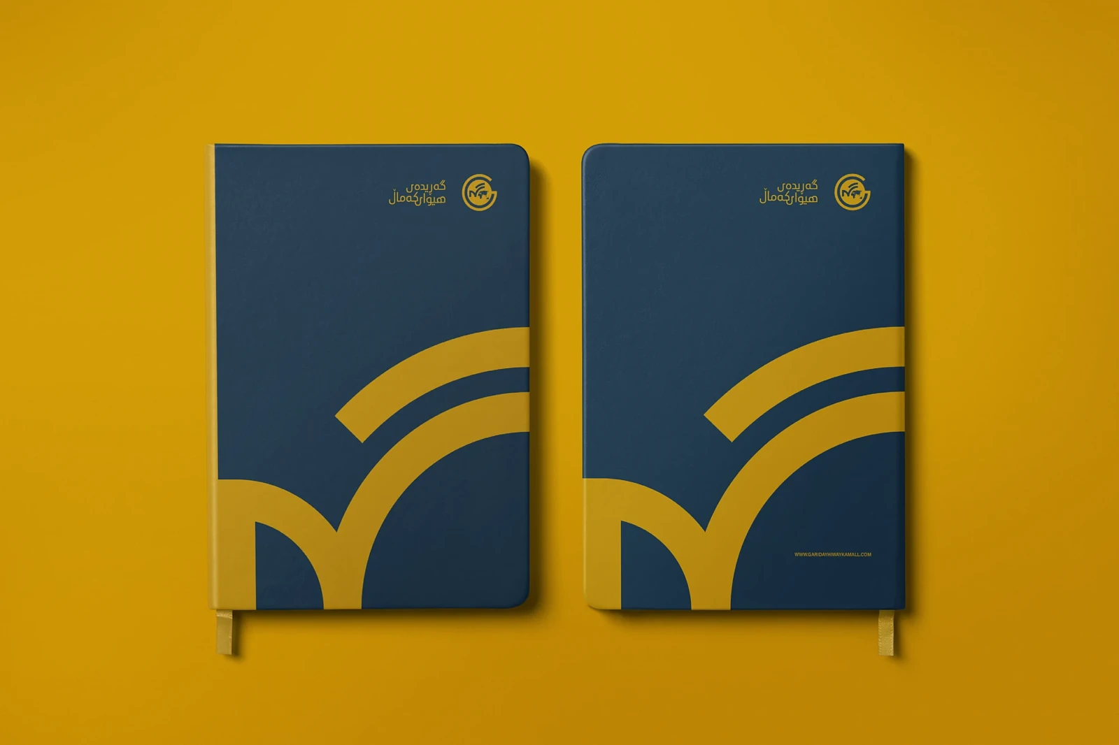
The mark sets a stylised globe inside an open G — the reach of the story, and the letter that carries the name. One rising stroke runs through the whole system: it is the signal in the logo, the pattern across the stationery, the graphic on a notebook cover, and the shape cut into the back of a press vest.
Two colours carry it. Harvest Gold for visibility in the field, Deep Space Blue for everything editorial and official. The Kurdish wordmark is set in Ubuntu Kurdish and drawn to hold at signage scale and at favicon size alike.
Delivered as a 25-page guideline: logo system with vertical and mark-only lockups, favicon, clear space, colour, typography and pattern, applied across stationery, ID, signage, merchandise and press wear.